In this (ongoing) personal project, I've looked at the relative distribution of first names by state in the US. Data on absolute popularity of first names is easy to find, but this project focuses on the relationship between names and location.
I'm currently in the process of writing a web application with Django for this project, but it's not ready yet. In the meantime, this page contains a detailed write-up and links to the files I've used and code I've written. Click on a section below to expand it.
I'm not sure what sparked my interest, but I've been curious about names and their distribution for a long time. This isn't even the first time I set out to study names—although it is the most throughly I've explored one of my thoughts on the subject. I began by looking at where a handful of names I was particularly interested in were most and least popular. One specific question I had was whether my own impressions (and perhaps, conventional wisdom) regarding the regional popularity of certain names reflected reality.
For example, I might have the idea that the name Colton is more popular in the western US, or that Brittany is more popular in the South. I found that it wasn't too difficult to get raw numbers for first names for births by state and year, and after adjusting for total births, I had my answers. But I'm a big fan of visualization, and after looking at just a few names, I realized I was becoming more engrossed. I wanted to check out more and more names, and I'd want to automate these calculations.
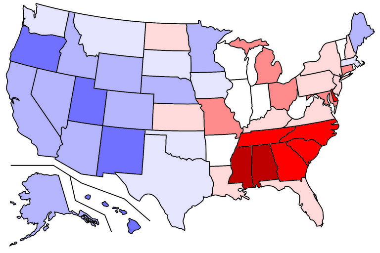
An example: distribution of the name Ava in 2017 female births.
I tinkered with different details for visualization, but it was always based on taking a US map and coloring each state according to the frequency of the name in that state. I'd been using the free GIMP editor for years without taking advantage of its "Python-Fu" feature, and this seemed like the perfect reason to learn how. This allowed me to automate the visualization process as well.
To the left is an example of one of these maps. In 2017, the name Ava was given to baby girls at a frequency of about 0.0124 in Alabama and 0.0116 in Mississippi (on the high end), and 0.0056 in Hawaii and 0.0057 in Oregon (on the low end). For more precise information on these values, read the Data section below.
There are a number of other specific questions I've wanted to explore with this data. I'll expand on them here in the future.
Data
The Social Security Administration's Popular Baby Names website is an excellent starting place for anyone interested in naming trends in the US—but it only goes so far. In particular, the SSA's website doesn't really feature a way to compare states. On its page "Beyond the Top 1000 Names", however, you can download state-specific data, saved as .txt files but containing comma-separated values.
These files, one for each state, are the core of this project. Each line in one of these files is made up of a first name, a US state, a year, and the number of babies born that year in that state with that name (sex is also recorded; the data is in fact sorted by sex, then year, then number of births). There are records for every year starting from 1910. Names given to fewer than five babies are not recorded.
My first calculations used only these files as a data source. They are nearly sufficient on their own, but their lack of records for names given to fewer than five babies presents a problem. To find a name's frequency, of course, both the number of babies with the name and the total number of babies must be known, and without records for the names given to fewer than five people, we can't know the total. Does it make a difference? It can, and does. There are several reasons a state/year combination might have an unusually high proportion of names given to fewer than five children: the presence of a greater-than-average number of small minority groups; a non-minority culture with more "free-spirited" naming habits; or a relatively low number of total births (which is especially likely if the population itself is relatively small).
Unfortunately, data on the total number of babies born by state, year, and sex is not as easy to find. Finding separate totals for males and females can be especially difficult. Since the sex ratio at birth is easy to approximate and hypothetically shouldn't vary too much between states, we might wonder, again, if accouting for this is truly important. Imagine comparing two states: one year, the name Ava is 1% of all female births in both states, but in state A, 50% of all births are females, while in state B, only 48% of all births are females. By not separating totals for males and female births, we get the result that Ava has a frequency of 0.0050 in state A, and 0.0048 in state B. While this does reflect the truth that Ava is more common in state A, for this project, I am more interested in the kind of conclusions that could be drawn more easily if male and female births are not pooled together.
There are several sources online for some of these data, but I haven't found any single source that contains all the data I've gathered myself. All the raw data appear to come ultimately from the same U.S. government source, but various organizations and portals have analyzed and packaged the data in different ways. In the Acknowledgments section of Vital Statistics of the United States 1993, the editors write:
The National Center for Health Statistics acknowledges the essential role of the vital registration offices of all States and territories in maintaining the system through which vital statistics data are obtained and for the cooperation in providing the information on which this publication is based.
While multiple divisions contributed to the production of that document, the National Center for Health Statistics (NCHS)'s Divison of Vital Statistics takes the most responsibility for its production. The Division of Vital Statistics and its predecessors, including the National Office of Vital Statistics, the Vital Statistics Division of the Bureau of the Census, produced annual reports titled
"Vital Statistics of the United States" for every year from 1937 to 2003; from 1932 to 1936, it published analogous reports under the title "Birth, Stillbirth, and Infant Mortality Statistics for the Continental United States, the Territory of Hawaii, the Virgin Islands", and in 1931, it published "Birth, Stillbirth, and Infant Mortality Statistics for the Birth Registration Area of the United States 1931". The history of the Division of Vital Statistics is entwined with several higher-level US government departments and offices and their predecessors, including the Public Health Service, the Department of Health and Human Services, the Center for Disease Control, and as stated above, the Bureau of the Census (under the Department of Commerce).
These reports often, but not always, provide the totals needed for this project. Over the decades, they grew dramatically in scope, and the tables providing these totals are not consistently located in the same section even when they are present. Nevertheless, I have relied heavily on these reports in the course of this project.
The CDC's WONDER online databases have relevant natality information in a much more accessible format, and provide the totals we need, but only for the years from 1995 to the present. Another potential data source is the the Divison of Vital Statistics's actual online portal, which actually provides much more detailed records than this project calls for, but only from 1968 on. Furthermore, these files are very large and require input code files. The National Bureau of Economic Research (NBER) provides the same data in different file formats without requiring input code files, but the actual totals we're looking for aren't recorded in either of these places, although the totals can be calculated using these data. Because I found these data sources before the published Vital Statistics reports, I wrote scripts to count the required totals using these data, but with the potential for counting errors, I preferred using the published reports once I found them.
One more very helpful source is a single file, sex_race_state_fips.csv, in which figures from the published Vital Statistics reports have been digitized, including those needed for this project (i.e., total number of babies born by state, year, and sex). Unfortunately, this file contains only the totals for the years from 1946 to 1968, and within that span, the years 1948, 1949, 1962, and 1967 are missing. Still, many totals can be found much faster in this file than in any other.
Analysis
Having only studied basic statistics, I cannot describe my statistical analysis formally, but I think the methods I've used are quite simple, and there were not many steps in the process. I am also writing for an audience that I do not expect to have advanced knowledge of statistics.
As I stated in the introduction, I was most interested in questions of relative frequency between states in this project. That is, I was interested in finding where a name's frequency was greater (or less) than average frequency across all states, and how much greater (or less) it was. First, I had to calculate the frequencies themselves, as I was starting with raw counts. Once the frequencies for each state were calculated, I calculated the mean of the frequencies and the standard deviation. I subtracted the mean from each frequency, and then divided the difference by the standard deviation. These values, called "standard scores" or "z-values", are the values I used in my visualization maps.
For the less statistically-minded, it might be beneficial to walk through an example. We are looking at numbers for all states, for one name in one year (and specifying male or female). Let's look at the name Ava in 2017 again. Each state has its own count of female births named Ava in 2017. The first five states are Alaska (33 births named Ava), Alabama (358), Arkansas (150), Arizona (261), and California (1522). The total female births in 2017 for these states were: Alaska (5098), Alabama (28874), Arkansas (18393), Arizona (40273), and California (229760). We'll divide to get the frequency of Ava in each state in 2017: Alaska (0.00647), Alabama (0.01240), Arkansas (0.00816), Arizona (0.00648), and California (0.00662). After we have all fifty states' frequency, we calculate the mean to be 0.00831 and the standard deviation to be 0.00165. Subtracting the mean from each individual frequency yields: Alaska (-0.00184), Alabama (.00409), Arkansas (-0.00015), Arizona (-0.00183), and California (-0.00169). Finally, dividing those numbers by the standard deviation yields: Alaska (-1.1152), Alabama (2.4788), Arkansas (-0.0909), Arizona (-1.1091), and California (-1.0242). These are the numbers we'll use.
These values tend to fall between 2 and -2, with typically only a few states outside this range for every name/year combination.
This calculation is the primary focus of this project, but I've also spent some time looking at a few other measures derived from it. In the latest iteration of my analysis program, the user has the option to write a file of "Python-fu" code that can be fed to GIMP to produce a map visualizing the standard scores, or to see this data in several other ways. Some of these other ways are still in a "testing" stage:
- Print all available names and their standard scores for a single specified state, ordered by standard score, to the screen.
- Write a file of "Python-fu" code for GIMP to produce a series of 100 maps, one for each of the 100 most popular first names for the specified year.
- Write a .csv file with values representing the similarity of two states' standard scores across the 100 most popular first names for the specified year. There are 1225 pairs of states; lower values represent greater similarity between states.
- Write a file of "Python-fu" code for GIMP to produce a map visualizing each state's similarity to one specified index state.
- Print all available names with a measure of how similar each of their geographical distributions is to the geographical distribution of one specified name. Lower values represent greater similarity between names. For example, the name most similar to Ava in geographical distribution in 2017 for females was Skylar (0.46099); it was relatively popular where Ava was popular, and relatively unpopular was Ava was unpopular. The least similar name for females was April (1.64189).
I will expand on the methods used to calculate these measures in the future.
I have also written a second program dedicated to the particular visualization of the geographical distribution of one name over time.
Here is my code, as well as other essential files, for this project as it stands now. As this project has undergone a lot of revision, some files I wrote have become completely obsolete; I won't include them here, but I'd be happy to provide them or describe them to anyone interested. I will also use this space to describe the data structures and operations in these programs in the future.
gimpUniversal.py: the main data analysis and interface program
gimpTrackNameThroughTime.py: a supplementary script dedicated to producing code for making maps visualizing the geographical distribution of one name over time
countAll.txt: an essential file containing data for both Python scripts
blankUS.xcf: a file used for the creation of maps with the "Python-fu" code generated by my Python programs. .xcf is the native image format of the GIMP image-editing program.
The .txt files available for download at the SSA's "Popular Baby Names" website ("State-specific data") are also required, and must be in the same path as the Python programs.
As this is an ongoing project, I am continually expanding its data scope, its functionality, and the efficiency of its code. I have lots of plans for the future, so please return and take another look soon!